A welcoming guide to paper, texture, weight and size
One of the questions I’m asked regularly in my workshops is, “What watercolour paper should I use?”
It’s a good question, because there are so many choices. Cotton or cellulose/wood pulp? Hot press, cold press or rough? 200 gsm or 300 gsm? Pad, block, sketchbook or whole sheet? It can all feel a little overwhelming when you’re starting out.
Over the years, I’ve developed some very definite preferences, but I’ve also learned that there isn’t one perfect paper for everyone. The best paper is the one that suits the way you like to paint and the paper that you gravitate to.
How thick should watercolour paper be?
I generally prefer to work on 300 gsm, and in my sketchbooks it is 270gsm. The heavier weight handles generous amounts of water beautifully and is less inclined to buckle as I work.
Watercolour paper is often sold in a few familiar weights, either in pounds or gsm (grams per square metre) : 90 lb is about 185–190 gsm, 140 lb is about 300 gsm, and 300 lb is about 640 gsm. You may also see 200 lb (about 425 gsm).
But I don’t think you need to start with the most expensive 300 gsm cotton paper you can find. One of the things I notice in my workshops is how intimidated people can become by a beautiful, expensive white sheet of paper. They know they’ve spent good money on it, so suddenly that first mark feels very important. There can be a real fear of “ruining” the paper.
I understand the cost of art materials, particularly with the rising cost of living, so I often encourage students to give themselves permission to experiment. A good quality cellulose, or wood-pulp, paper can be a wonderful place to start. You can practice, try things out and learn what you enjoy without feeling that every sheet has to become a finished painting.
Cotton, cellulose and paper blends
Watercolour paper is usually made from cellulose (wood pulp) or cotton. These materials respond differently to water and to techniques such as lifting colour, glazing and reworking an area.
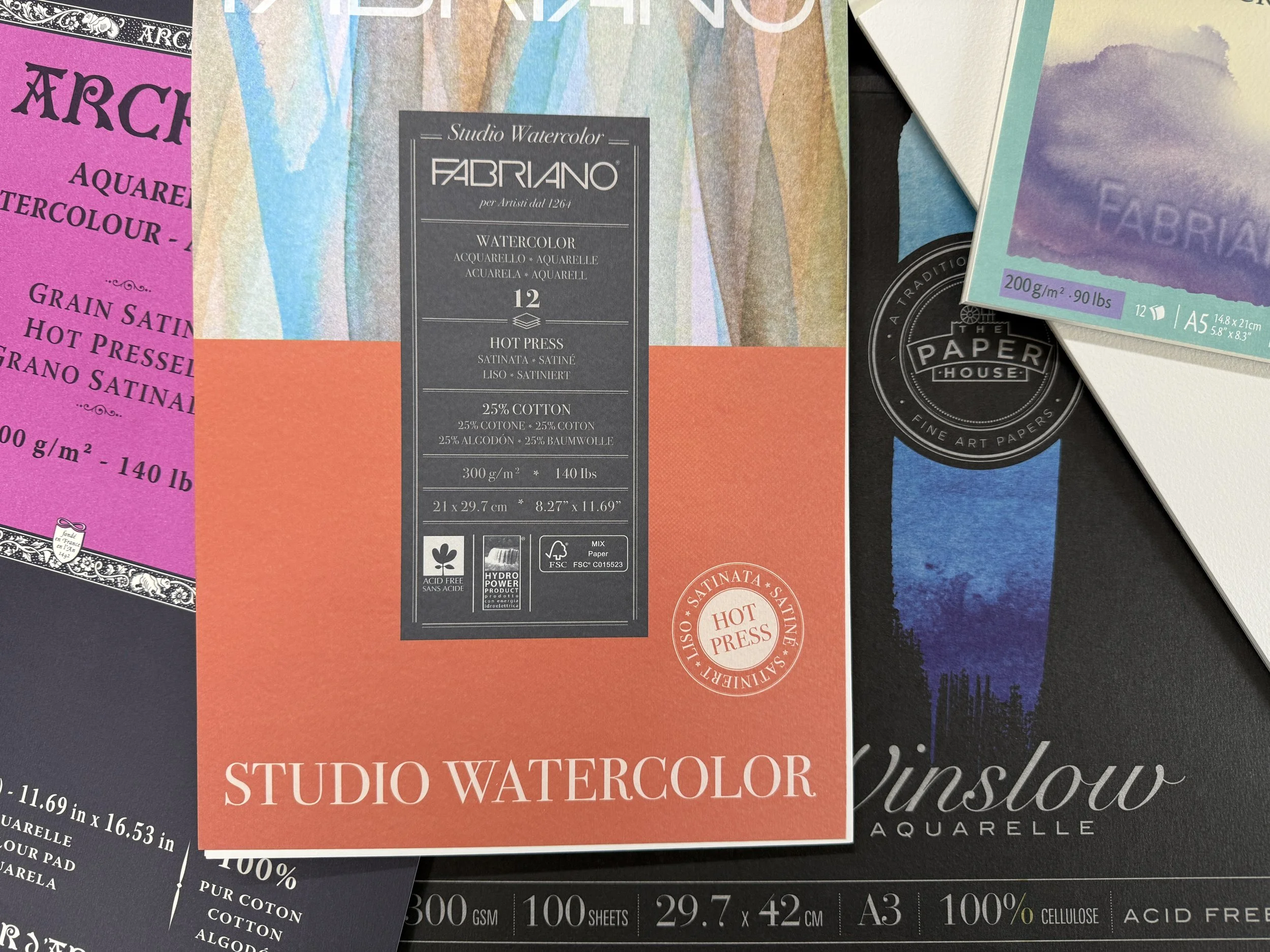
Cellulose paper is often more affordable and is a practical choice for learning and regular practice. Cotton paper is often prized for the way it handles water and pigment, though the exact feel depends on the paper’s surface, sizing and how you paint. Blended papers sit between these options. For example, Fabriano Studio has 25% cotton, with 200 gsm and 300 gsm options. Winslow is a 100% cellulose paper, with a textured surface. It is great for experimenting in a more cost effective way. If wood pulp/cellulose paper is too thin it tends to act like blotting paper where the pigment is absorbed too quick for mixing and with too much water or paintbrush agitation the paper will fall apart.
There’s no rule that says you must use 100% cotton to make good work. If you need archival qualities for selling or framing your work, 100% cotton is needed. If you’re unsure, try a few sheets or a small pad before committing to a large pack. Notice how the paper behaves with your own brush, water and pigments.
Hot press, cold press and rough
The surface texture changes the way a painting looks and feels. Hot-pressed paper (HOT) is smooth and can suit fine detail and crisp edges. Cold-pressed paper (NOT) has a gentle texture and is a versatile all-round choice, often thought as slightly more beginner friendly, allowing more lifting and paintbrush agitation. Rough paper has a more pronounced tooth that can catch pigment and create lively, broken marks.
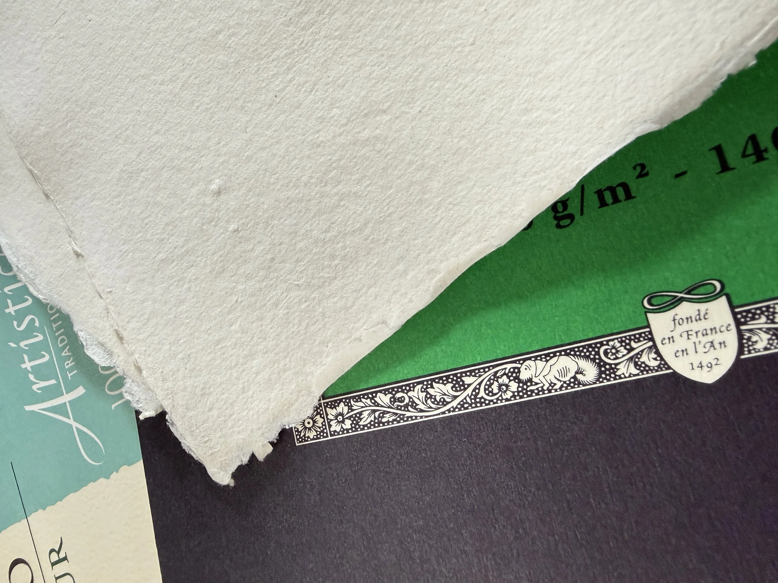
Names and textures can vary between manufacturers, so if you can, look at a sample in person or test a small pad. The surface you enjoy working on matters more than choosing the “right” label. I love to use hot-pressed paper, allowing for a smoother surface for mark-making, using nib pens and sticks with watercolour. The ‘coffee cup’ tide marks are stunning on smooth paper and you can still make dry brush marks with some practice.
Choosing a paper size
A-series sizes are familiar across Australia and the UK. A4 is a common everyday page; A3 is twice the area of A4 and gives you more space to work. A5 is compact, while A2 and A1 offer much larger working areas, or sheets to tear up smaller. B-series papers such as B5, B4 and B3 are another standard family, more found in sketchbooks. Generally a little larger than nearby A-series sizes.
Watercolour artists also use traditional full, half and quarter sheets. A commonly found full sheet is around 56 × 76 cm (22 × 30 in), with half and quarter sheets cut or torn from it. Exact dimensions can vary slightly by manufacturer, so check the listed size when ordering.
In the United States, paper is often described with inch-based names such as Letter (8.5 × 11 in) and Tabloid (11 × 17 in). Artists in the US and UK may also refer to watercolour paper by full, half or quarter sheets in inches. These traditional watercolour sizes do not match A-series sizes exactly. My downloadable Watercolour Paper Sizes Cheat Sheet can help you compare the common formats at a glance.

Pads, blocks, sketchbooks and sheets
Paper is sold in several formats. A pad is convenient for practice and everyday painting. A block has sheets glued around all edges, which helps keep the paper flatter while you work. A sketchbook is easy to carry and encourages regular, low-pressure practice. Individual sheets are useful when you want a particular size or like to cut/tear paper to suit a painting.
There’s no need to begin with large sheets. A familiar sketchbook or A4 pad can be a comfortable place to explore. As you gain confidence, you can choose a larger format when the subject or your process calls for it.
A simple way to get started
If you’re new to watercolour, start with a paper you can afford to use freely. Try a few different surfaces and weights, and pay attention to what happens when you add water, layer colour or lift a mark. Your preferences will become clearer with practice.
Paper size and paper quality are separate choices. Big paper isn’t automatically better, and expensive cotton isn’t required at the start. Choose a size that feels inviting, then give yourself room to experiment. Most of all, use the materials you are drawn to, that feel good, its a personal choice and will show through in your work.